
The UK (and most of the rest of Europe) has just experienced the hottest days on record. Record temperatures over 40 degrees Celsius were recorded across the UK in a heat wave created by climate change.
There are always going to be people who think the science is wrong, or that they know best- that’s part of the rich tapestry of humanity, we don’t all agree. But with this heatwave, there has been extra controversy over the recent (2021) change to weather graphics produced by the met office. People have accused the government/scientists/the media of trying to create hysteria and panic.
But what is the reason for the perceived change in design, what was the issue with the original and ‘loved’ style of graphics, and more importantly, why does it matter?!
The (brief) history of Weather Broadcasting
The BBC has been broadcasting weather reports since its creation first on the radio (who doesn’t love the ASMR qualities of the shipping forecast) and then on TV, and now on digital services. In the pre-digital age, they had in short a whiteboard and some pens. The map was permanently painted and then the weather symbols and detail added on for each broadcast.

1949 
1954 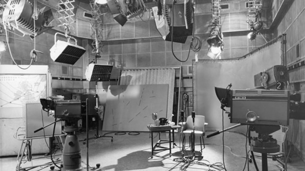
1960
As we moved out of the 60s and into the 70s things changed – and colour was the new kid in tech town. With the introduction of better printing facilities and coloured TV sets, it made sense for the weather forecast to embrace these changes. But TVs were still small and low quality so graphics needed to be simple and easy to read. This is how we came to have the now ‘classic’ weather symbols.
With simple colours and bold clear symbols, this style of weather reporting was here to stay and lasted well into the new millennium. It didn’t come without its issues, as the symbols were magnetic they had a tendency to fall off and move around.

1970 
1975 
1975 
1981
Heading into the 90s the big revolution happened – digital graphics, this move away from physical objects to the digital blue screens had new challenges for presenters who had to learn a new way of presenting without the physical object behind them. It also allowed for more detailed maps and location names to be added – making it far easier for people to understand the report.
This was the first map to add texture and topography to the visuals, moving on from the flat design of the past. It was also favoured for UK presenters to wear red (or black) as blue interfered with the technology and caused the map to be projected onto their clothing.

1990s 
1990s 
1990s 
Asian Map 1990s
By 2005 the BBC made a controversial decision to ditch the Mercator map in favour of a tilted map that gave audiences a more 3D perspective – it was universally hated, including being blamed for the loss of the Scottish independence movement in 2014.
It did however give a more accurate view of the weather, showing data and weather formations rather than symbols. Layering Met Office weather data displayed over true 3D maps using ‘Weatherscape’ (created in New Zealand). Weather data is shared in real-time across all the BBC regional centres and online outlets. 3D broadcast graphics are all rendered in real-time, making this one of the biggest changes to weather broadcasting since the introduction of colour.

2006
In 2018 the controversial map was finally laid to rest, with a return of a flat map – more reflective of maps available on smartphones and other personal devices. This also came with a host of more detailed and reliable data with the BBC calling it ‘the biggest change to BBC Weather, both for UK and international audiences, for more than ten years.’

2019 
2018
So what’s the problem now?
In 2021 small (to the untrained eye) changes happened to the Met Office and BBC weather maps, after a period of consultation, they implemented better design practices for disabled audiences.
As you can see from the (non-UK) example below someone who is visually impaired or colour blind might be unaware of the dangers the weather system poses as they are unable to distinguish the colours.

Broadcast Map 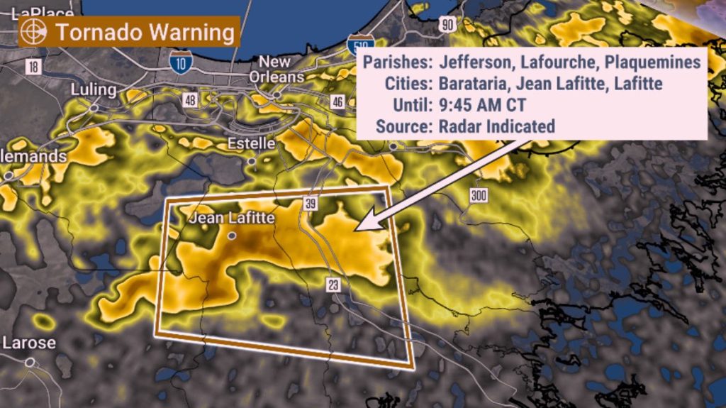
View of someone who is colour blind
The changes made to maps in the UK are to move away from colour changes to hue and intensity changes, making it much easier for people to see the differences in data.
“The colour scale was designed for accessibility reasons – for colour blind people like me, it’s easier to distinguish different colours when there is a gradient from light to dark instead of just changes in hue,” – Aidan McGivern 2022
Sadly this has led to a new conspiracy theory online, that the colours have been altered to make the general population more afraid. This meme was the main image floating around the internet on the days leading up to the heatwave.
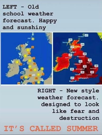
Not only is this an altered image as the graphics had been redesigned early in the year, but also the map view, temperature symbols & colour scale had also been changed. This image uses the old map view, and the old symbols but not the old temperature colours – it’s a combination of elements designed to create a negative reaction. The old scale (which used a mixture of blues, greens, oranges, and reds) wasn’t accessible for people who are colourblind.
The new temperature colour scale does go darker when it gets hotter, especially >38.7 C, which at the time was the UK record It also goes darker when it gets colder – as demonstrated here where the new colours are more muted in hue but clearly show temperature by intensity.

Old 
New
When this new design was created in Autumn 2021, only parts of North Africa and the Middle East were expected to reach >39 C. The theory was that these temperatures would turn up occasionally in Spain in the summer but not be seen in the UK or by main UK audiences.

2022 record tempretures 
social media symbols 
standard UK forcast
The Met Office usually uses data-driven maps rather than weather symbols with its forecasts, although you can still see the classic symbols on social media posts. Why the move? simple really, the same reason for all the other changes to the way we show weather forecasts – technology has improved allowing us to give more detailed maps and information.
This isn’t about misleading audiences (as some claim) it’s in fact the complete opposite; about giving audiences clearer and more accurate data. Better technology has enabled better, and more accessible design.